My thoughts exactly... on
VIDEO AND AUDIO MARKETING
How can people watch your video... if they can't find it?!
Okay, so sometimes it's best to just 'show' what the heck you're talking about, so click play...
As as promised, here's their video... once you find it:
As I mentioned, I think Bewilderwood looks like an awesome place to visit with the kids and they are doing SO much right with their site, business and social... I'm not picking on them as such, just using them as an example of something that so many companies get wrong.
If you've made a great video, let people see it!
Want to make a great video? Get in touch!
(NOTE: In August 2015 I finally went to Bewilderwood. It really is a magical place to take kids. In fact, we returned in August '16 too. So great that an independent business (you know, not part of the big tourist attraction magnates) can be so imaginative and create a place without the need for any technology-based 'rides', just encouraging the joy of playing outdoors... Head to Norfolk with the kids and enjoy!)
#HIBERNOT
“Land Rover aren’t just selling us the car.
They’re selling us the story.”
Hibernate? No Chance. #Hibernot
That was the brilliant message Land Rover ran, or drove, with all winter long.
Don't sit indoors. Get out there and enjoy life. Especially if it's in a Land Rover.
This was an epic cross media marketing strategy powered by a) a LOT of money and b) several agencies working to make it happen. But that doesn't mean there aren't lessons any business can pull from it.
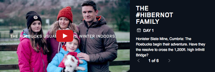
Video was a major tool in the campaign and at the heart of it all was the #HIBERNOT family. Taking a 'real family' and making them trade their sofa for a week exploring and having fun together (in a Discovery Sport).
What's key here, is Land Rover aren't just selling us the car. They're selling us the story.
7 days of adventure for them to share. 7 videos for us to share.
“7 days of adventure for them to share.
7 videos for us to share.”
'Look at how this car brings the family together and lets them bond and live life in the way we all dream of, look Dad, you're not a loser in a xmas hat, you're a real man!' it says.
This could be your life too! Well, almost. Even if you could afford a Discovery Sport, it'd be an even bigger stretch to book Ray Mears to hang out with you for the day (genuinely - Day 3, Dad rather handily had to utilise the extra hidden seats in the boot to make way for their foraging hitch hiker).
This was a great campaign. Reclaiming 4x4s from the school run image they've gained over recent years and using great storytelling to sell us the lifestyle of a family united.
Honestly, #HIBERNOT is so immense in its ambition that I could talk about examples of what it did well for far too long. The best thing to do, if you're interested, is check out their site that has brought together all of the material.
The final day of Land Rover's Winter, was celebrated with this video:
So how can your business learn from #HIBERNOT?
Just think hard about this question:
How can you tell the story of what your product/service can do for real people?
Don't just sell a product. Sell a lifestyle. Sell a better version of me. I want to buy that change.
Show me how that's happened to someone else. Let me see the change.
It doesn't have to be 'sexy' like cars. It doesn't need a celebrity with a handy knack for surviving without matches. I'm not going to pretend it doesn't take vision, nor for that matter, a healthy budget, but it will set you apart from your competition if done right. It's about moving beyond an 'About' video and a 'How To' video and creating something special, sharing a story that shows just how awesome my life could be if I had your 'product' in it.
Make Your Video Part Of Your Site's Design
“Web Design & Video are key to your brand.
They’re a hot couple, they deserve to be seen together.”
Recently I teamed up with design agency 71Degrees to create animated videos as part of the new site for their client Event UK.
From the outset, our intention was clear: to create videos that were part of the site's design and thus part of the visual brand.
We were able to use the style of the site, the colours, fonts and actual artwork like the icons within the video so it feels totally at one with the page. Plus Andy at 71Degrees created customised thumbnails to sit at the start of the videos - so it totally felt part of the site with an obvious play icon. We then stripped back the embedded Vimeo screen furniture like titles and share buttons and customised the play bar to be the same colour as the site as well.
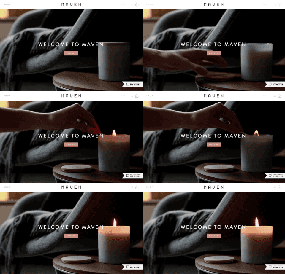
This is screen capture of the site in action:
Above: screen capture (without sound) of eventuk.co.uk homepage - take a visit for the full experience
I haven't embedded the videos I produced for them on this post as clearly I think you should watch them on the site itself, so take a look and imagine how it could work for you: www.eventuk.co.uk
And it's not limited to animation
Just make sure the graphics are in keeping with your site as well as the framing of the embed itself. Check out this great example by Artisan State.
Just one scroll and the next 'panel' of their site comes seemlessly to life as a video (that's another Vimeo embed by the way, this time with all but the play button removed).
Live action video also works in keeping with the site's design in this example above (not made by me).
But why does it matter?
Your visual brand is key - every little bit of design reflects on what the message of your business is from your business cards to your vehicles. It doesn't get more visual than a video.
And besides, it looks cool. Imagine the shiny new EventUK site above with a doodle style video embedded in a YouTube frame. It would be like fitting your lounge with the finest furntiure and then buying a rug from the pound shop.
Web design and video are key to your brand. They work well together, they're a hot couple, they deserve to be seen together. So, next time you're having your site redesigned, think about how you'll introduce them to the world.
Want to work on something similar for your site? Get in touch!
Pancake Day - Flipping Great Video from John Lewis
Ahead of Shrove Tuesday comes Shrewd Marketing Monday. And John Lewis' facebook feed delivery is as brilliantly sweet and simple as any good pancake should be.
“Ahead of Shrove Tuesday, comes Shrewd Marketing Monday”
I have to say, (chef) hats off to John Lewis.
Making the most of the Facebook video placement yet again, this time with a video to last just two days. But one of those days is Pancake Day. And ahead of Shrove Tuesday, comes Shrewd Marketing Monday.
This was in my Facebook feed...
Unlike the coveted crepes in our house, John Lewis' are definitely made for sharing.
Just look at the amount of social activity. And the thing is, they're not expecting to sell me that frying pan, oversized spatula, plastic bottle etc. What they're selling is a dollop of happiness, drizzled with anticipation and inspiration. Imagine the kids' faces if I pulled this off! They want me to sallivate at their brand.
The whole production and social delivery is as brilliantly quick, simple and sweet as any good pancake should be.
Though frankly, they've mucked about being clever with their designs so much that the pancakes themselves look over cooked. I think I'll probably stick to a 'sun shaped' pancake after all.
Osmo - Play the video - Play the Product
How the ingenious iPad toy Osmo promoted their 'Play Outside The Screen' device with perfect on screen storytelling.
No voiceover. No fancy graphics. Just the story. Just the experience.
“Perfect storytelling.
This doesn’t feel like an advert, it feels like an experience.”
A big hit on Christmas Day 2014 was the arrival of Osmo in our house.
Not a new Sesame Street character, but an ingenious toy that enables kids to play 'beyond the screen' with their iPads.
But what made me buy it?
Their video:
It's great. The way it tells the story of the product: the parental set up, the boxed games, the collaboration between kids (though mine would fight a litlle more I'm sure, it's almost like these kids are actors!), the emotions: pride in solving puzzles, the 'woah' cool nature of the dinosaur section... all shot in a stark white studio that reflects their brand and fits perfectly on their site.
And notice, there's not a single word of voiceover, nor on screen graphic overlays. This doesn't feel like an advert, it feels like an experience. I'm sold on the story, I'm sold on the product. Sometimes it pays to strip it back and keep it simple.
As a footnote from a marketing perspective: the way I discovered the video was by its continued appearance in my Facebook stream, so hey, that worked too.
Podcast Sponsorship
You don't have to be the one creating the content.
Find a podcast inline with your business and you'll find a passionate, dedicated audience ready to hear your message.
“You don’t have to be the one creating the content...”
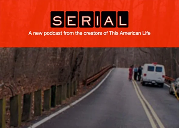
Like much of the world, I was a Serial addict.
Gripped by a podcast that became a global phenomenon in the latter stages of 2014, picking up an audience of millions in just a couple of months as it followed the investigation of a real life convicted murderer and a possible miscarriage of justice.
Why mention it?
1. You really should listen. It’s a sublime piece of audio production and storytelling.
2. There’s a lesson here on what businesses can do, because no Serial listener could fail to tell you which company sponsored it from the beginning: MailChimp.
And as Serial's popularity went through the roof suddenly audible, Squarespace (incidentally a web company I only know about because of their long time sponsorship of the Answer Me This podcast) and others lined up to be associated with it.
Yes, sponsorship is a marketing tactic as old as time, but that's because it really is effective.
This could be you too.
I mean, sure if you’re after a global digital audience, this could literally be you - contact the makers of Serial, sign the cheque for series 2.
But what I mean is… you don’t have to be the one that is creating the content.
Just like Mailchimp, you can capitalise on sponsoring somebody else’s.
“Find a podcast whose audience is your audience”
Find a podcast whose audience is your audience.
There is pretty much a podcast for every industry and every interest on iTunes and it doesn’t matter if the podcast isn’t huge audience wise, what matters is that it’s a good fit.
Have a listen and if you enjoy the podcast and like what they’re doing, why not support it? Contact the producers… you won’t pay a huge amount for a podcast that isn’t raking in a huge audience, most will be glad to have your interest if they’re currently unsponsored.
Podcasts can provide reliable audience data (unlike TV, radio and press): it may be a smaller audience, but it'll be engaged and it'll be targeted.
Podcasts tend to be listened to without 'fast forwarding' through the ads (unlike TV and press): your message will be heard, no doubt about it. But remember, it's all about brand awareness.
Don't expect a massive spike in profits immediately you jump on board and above all, stick with it - the best effect is drawn from repetition.
Everyone who has heard Serial from the beginning will tell you Mailchimp’s name, in fact they’ll doubtless know their tagline 'Send Better Email' and be able to lip-sync the voices that say the company’s name at the start of each episode.
Rather aptly, for a post was inspired by Serial, I think sponsoring a podcast has got to be a marketing technique worth investigating for any business.
Upddate - February 2016
Since writing this piece podcasts have the sponsorship of them have boomed. Sponsoring a podcast you'll find companies from small ambitious start ups to the might of Ford.
And I too have my own podcast sponsored. The particular company I chose to go with contacted me, liking the quality of the show and recognising that my audience was also their intended audience.
So, who's your audience?


